Search
Color
| Element | Property | Color token |
|---|---|---|
| Field | background-color |
|
| border-bottom |
| |
| Label text (fluid) | text-color |
|
| Placeholder text | text-color |
|
| Search icon | fill |
|
- Denotes a contextual color token that will change values based on the layer it is placed on.
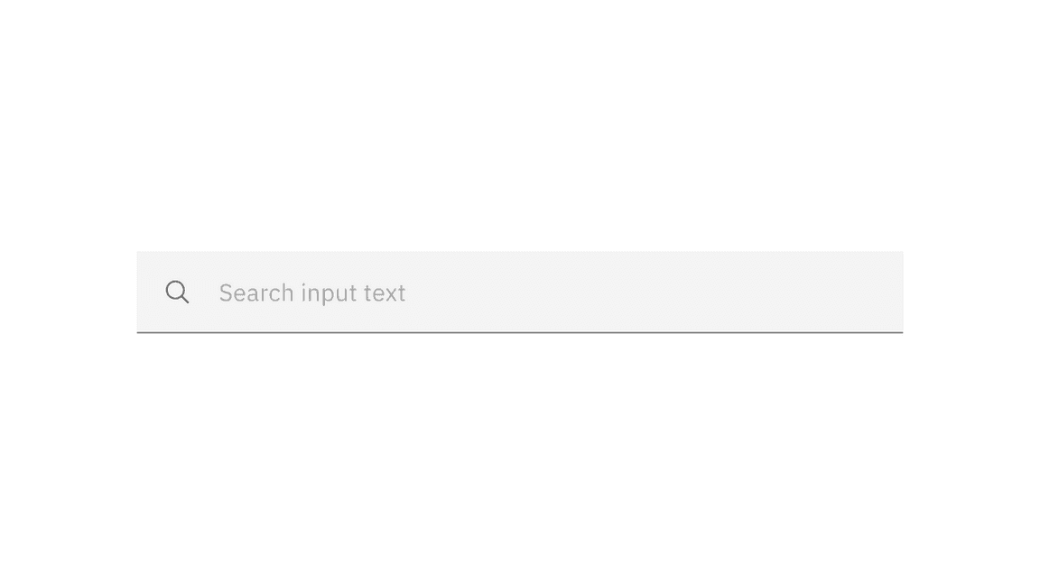
Example of search
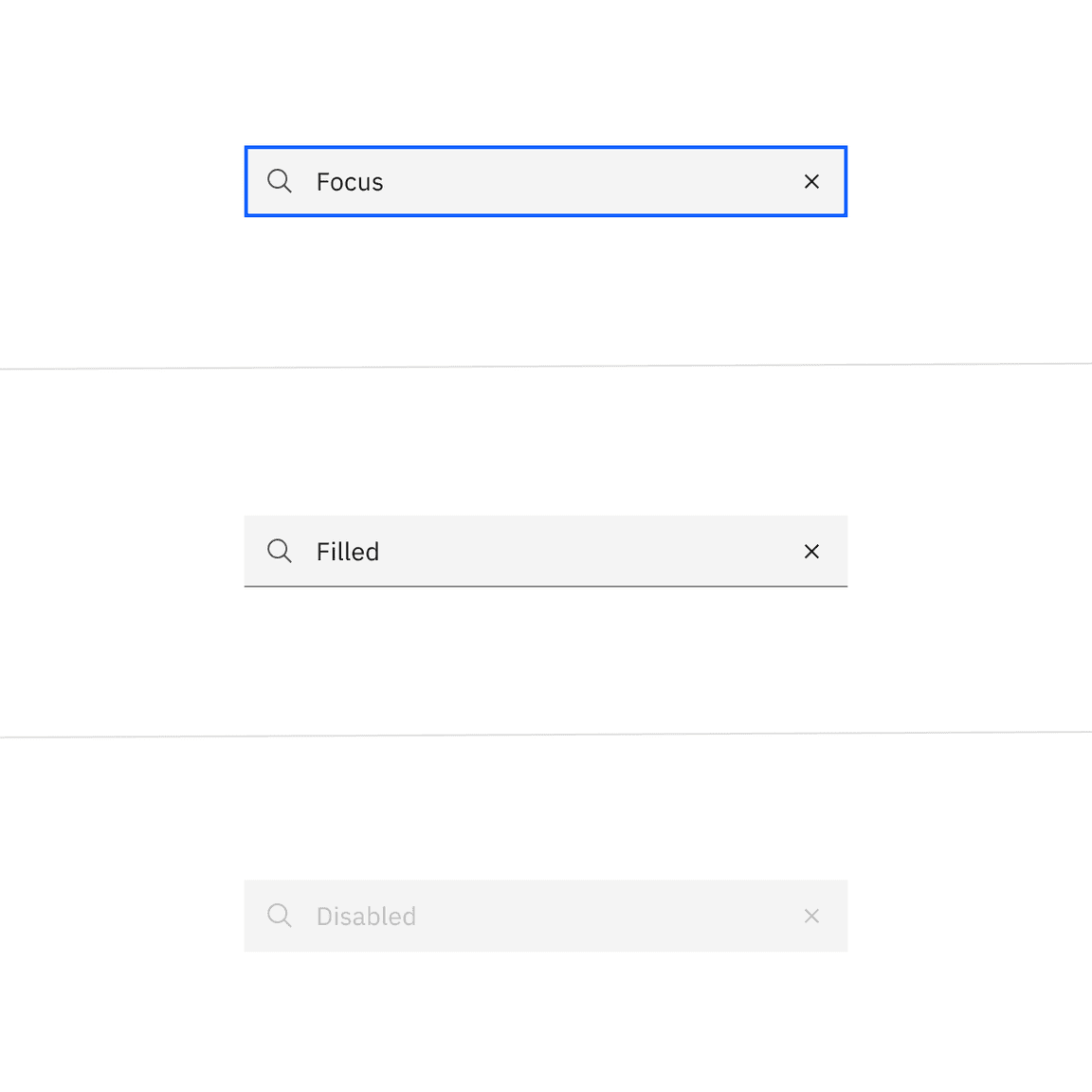
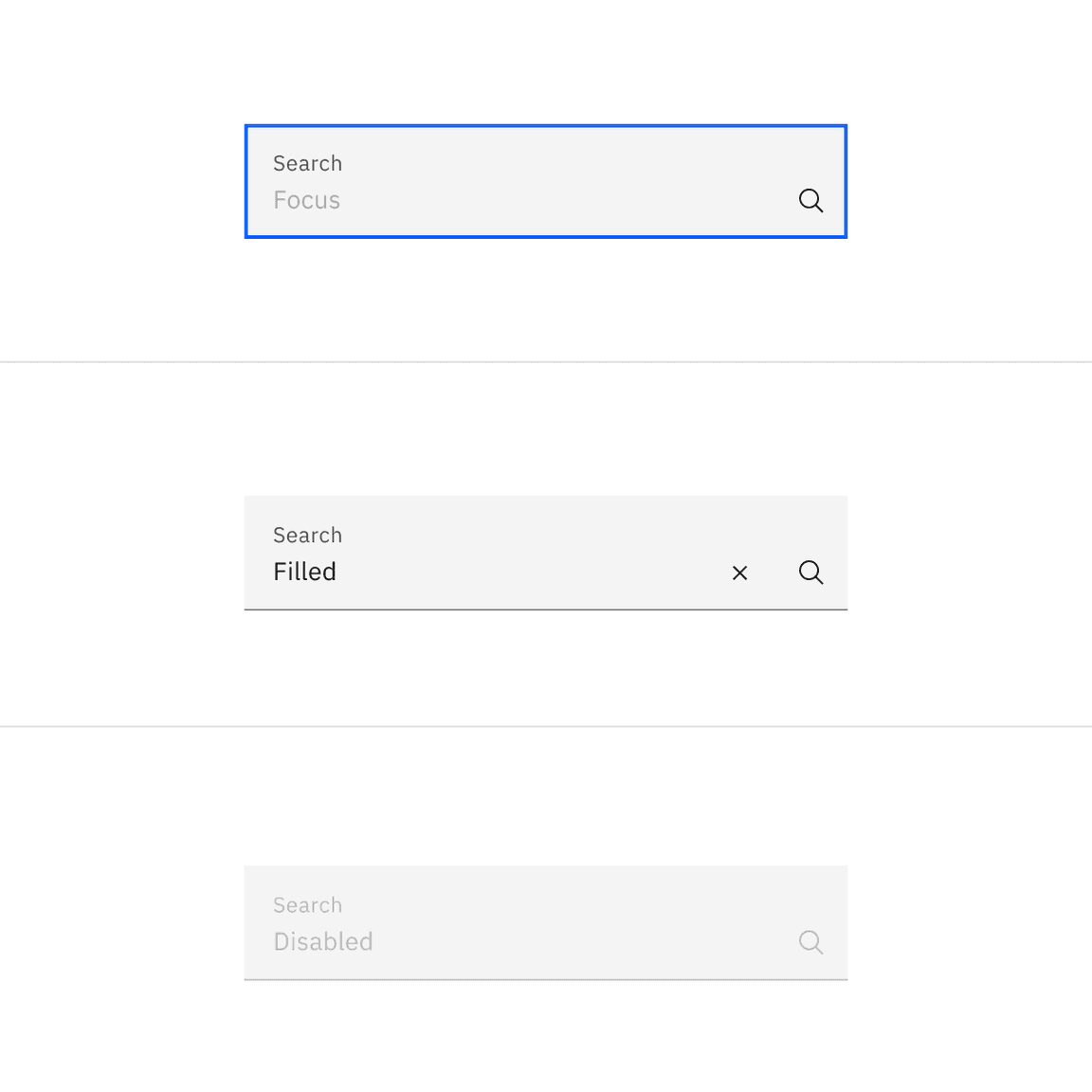
Interactive colors
| State | Element | Property | Color token |
|---|---|---|---|
| Focus | Field | border |
|
| Filled | Field text | text-color |
|
| Close icon | fill |
| |
| Disabled | Field text | text-color |
|
| Label text (fluid) | text-color |
| |
| Search icon | fill |
| |
| Field (fluid) | border-bottom |
|
Typography
Search text should be set in sentence case, with only the first letter of the first word capitalized.
| Element | Font-size (px/rem) | Font-weight | Type token |
|---|---|---|---|
| Field text | 14 / 0.875 | Regular / 400 |
|
| Label text (fluid) | 12 / 0.75 | Regular / 400 |
|
Structure
Default inputs
The width of the search field should appropriately fit the design and layout of content. The width may vary based on the grid and layout.
| Element | Property | px / rem | Spacing token |
|---|---|---|---|
| Search icon Close icon | height, width | 16 / 1 | – |
| Small field | padding-left, padding-right | 32 / 2 |
|
| Medium field | padding-left, padding-right | 40 / 2.5 |
|
| Large field | padding-left, padding-right | 48 / 3 |
|
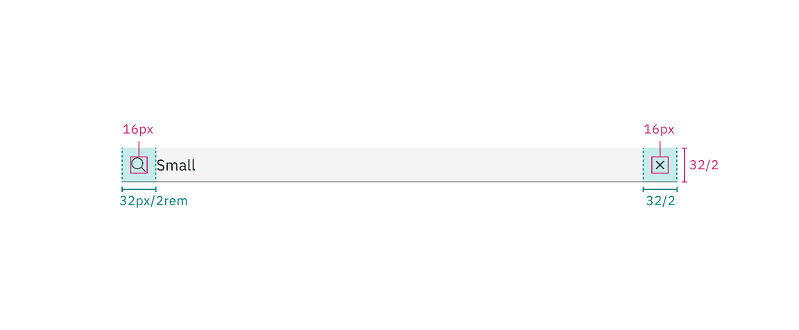
Structure and spacing measurements for default small search | px | rem
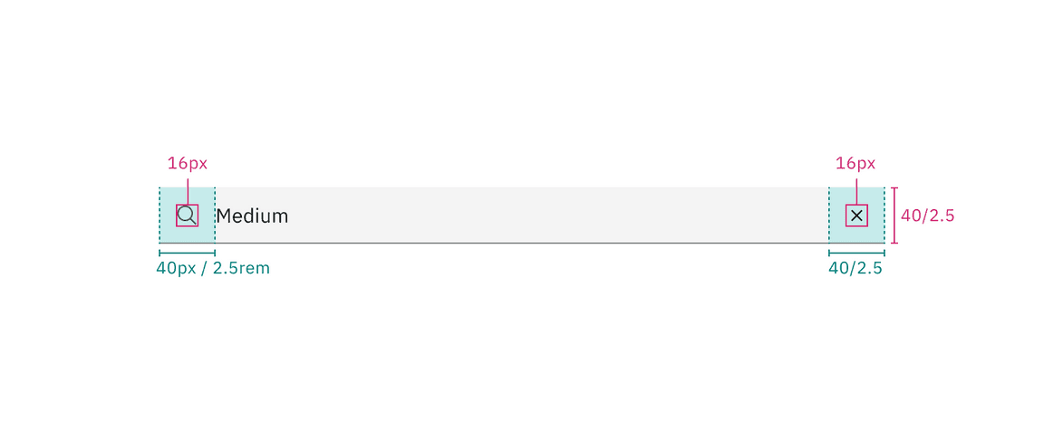
Structure and spacing measurements for default medium search | px | rem
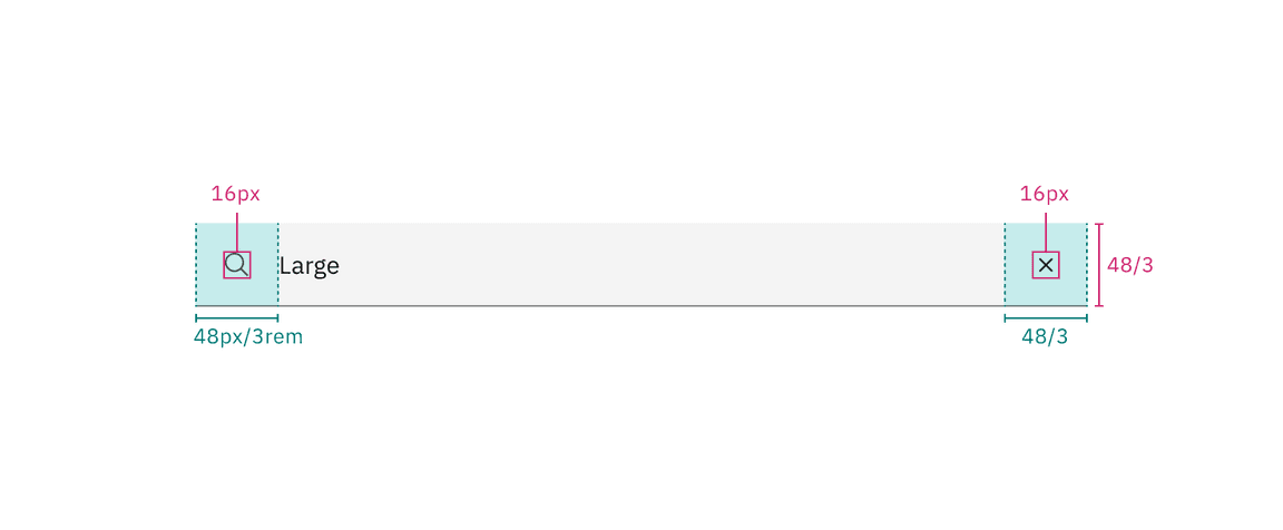
Structure and spacing measurements for default large search | px | rem
Fluid inputs
The width of the search field should appropriately fit the design and layout of content. The width may vary based on the grid and layout.
| Element | Property | px / rem | Spacing token |
|---|---|---|---|
| Label | margin-bottom | 4 / 0.25 |
|
| Field | padding-left | 16 / 1 |
|
| padding-right | 80 / 5 |
| |
| border | 1px | – | |
| margin-top, margin-bottom | 13 / .8125 | – | |
| Close icon | padding-right, padding-left | 12 / .75 |
|
| Search icon | padding-right, padding-left | 12 / .75 |
|
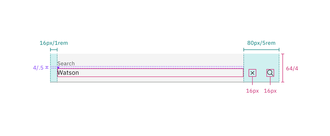
Structure and spacing measurements for fluid search | px | rem
Sizes
| Size | Height px / rem |
|---|---|
| Small (sm) | 32 / 2 |
| Medium (md) | 40 / 2.5 |
| Large (lg) | 48 / 3 |
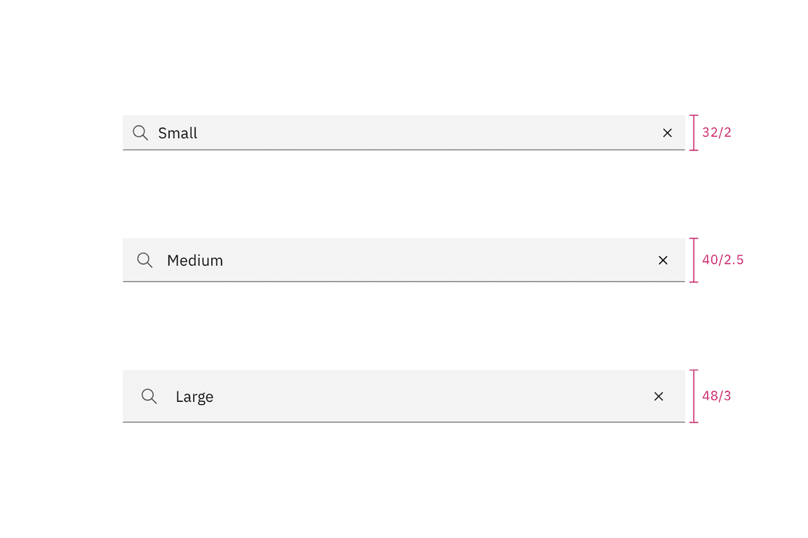
Search sizes | px / rem