Overview
Feature flags enable new behaviors and styling, allowing users to opt-in to new breaking changes while staying on the current major version.
Overview
When a new feature flag is introduced, it is set to false or “off” by default to ensure backward compatibility. We are not deprecating the current components but encourage all teams to use the new feature flag-enabled components in their products moving forward.
Components with feature flags
The following components have feature flags, with changes related to either design or development.
How to implement
Code
Each framework handles feature flags differently. At the moment, only React has available feature flags. This may change in the future, check back later for updates related to all available feature flags.
The development specifics for feature flags in React can be found in the @carbon/react framework.
Design
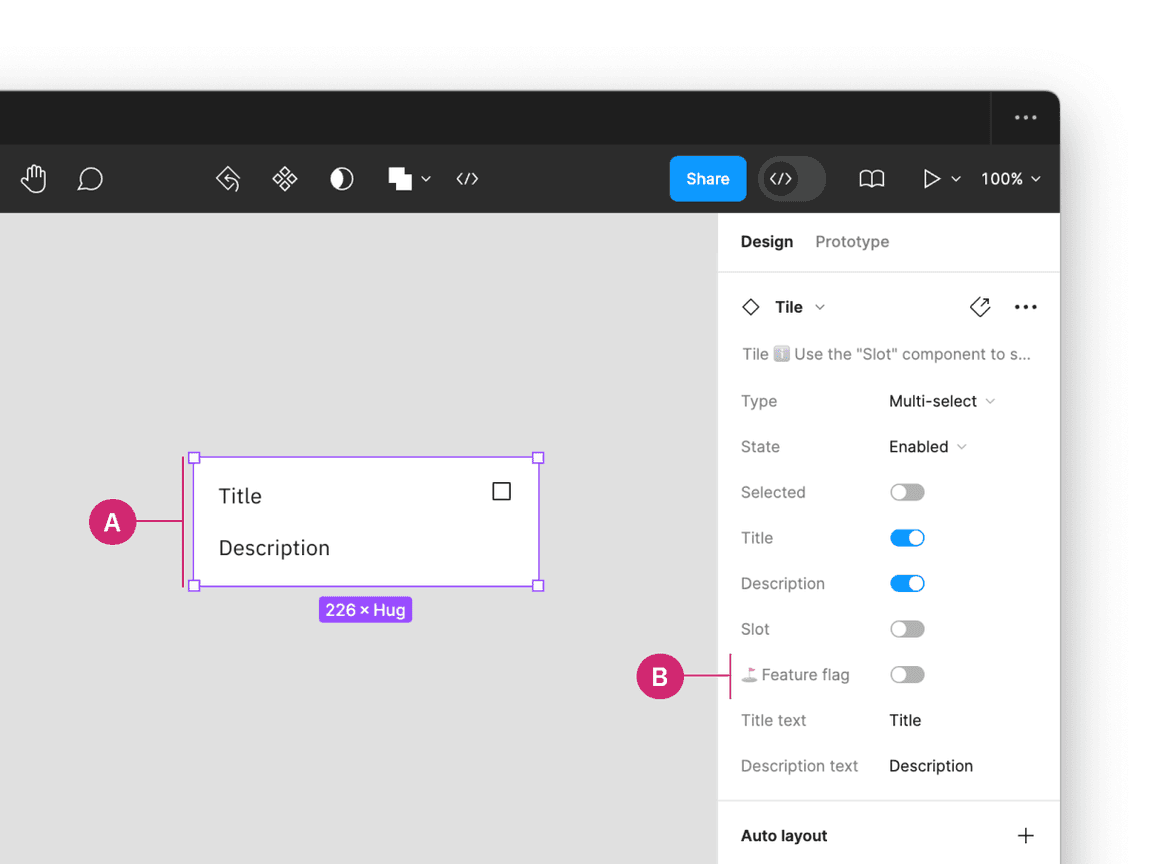
Inside a design file, click on the component with a feature flag (A). In the properties panel, locate the Feature flag boolean property (B). By default, this feature is turned off, but can be toggled on to enable the feature flag.

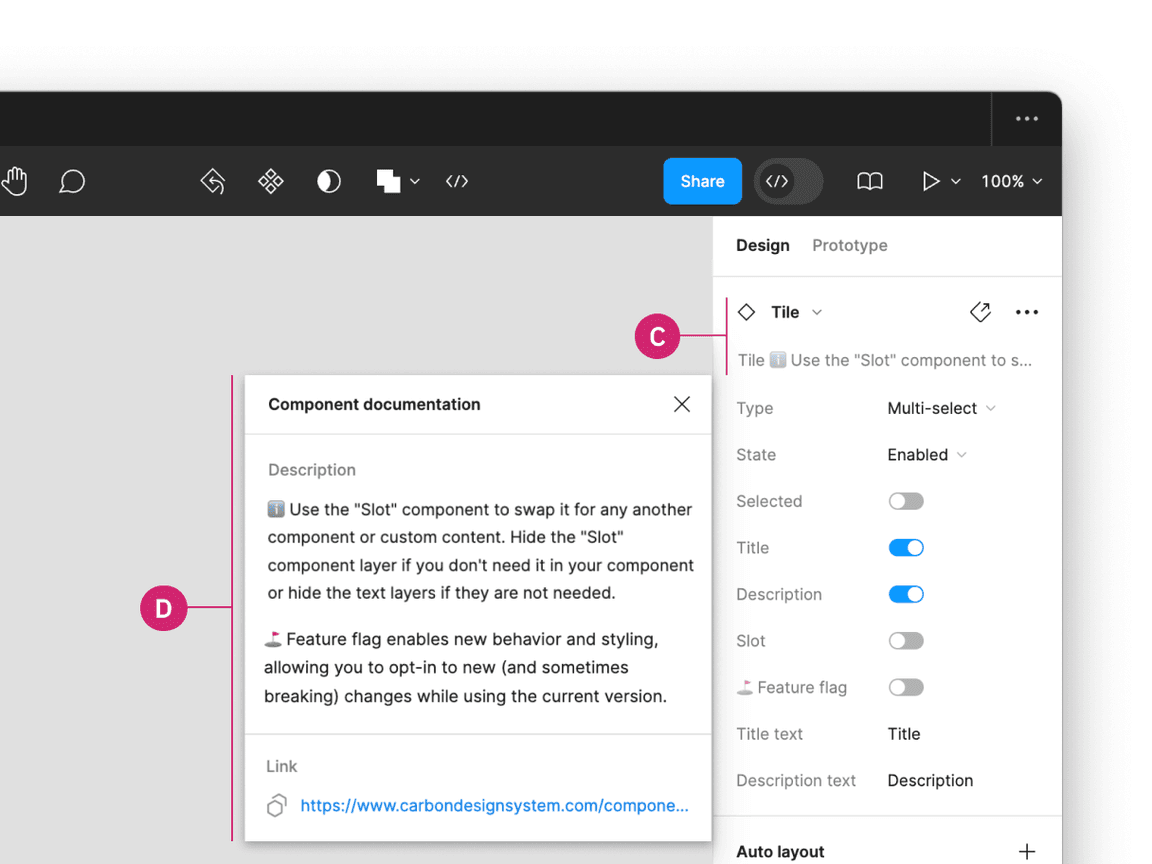
Additionally, when clicking on the components details (C) in the properties panel, a description of the feature flag, and a link to the component’s usage guidance is provided for more information in the Component documentation window (D).
